I have big-deal news to end 2012 and to start 2013.
To my amazement, I just learned that my painting, "Heartbreak Morning" received enough votes on Katherine Tyrrell's Making a Mark blog to be declared Best Portrayal of a Place 2012!
But wait...there's more. By SEVEN, votes I also received the award titled Best Picture on an Art Blog in 2012! I can't begin to explain all that went into the process of these awards. To learn more, please take a moment to visit Making a Mark by clicking the link in the previous paragraph.
Thank you Katherine Tyrrell for nominating my painting. I also want to thank all who voted for me - especially those special SEVEN!
Being an artist is a solitary occupation, especially now that I no longer teach. Sometimes I just need to connect with others and I do that primarily through this Art Journal blog and Facebook. Thanks to all who read my blog and take a moment to send me a word of support or a 'like' or comment on Facebook. Hearing from you helps make my day. Happy New Year!
Monday, December 31, 2012
Saturday, December 29, 2012
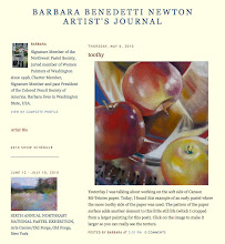
happy new year

Thursday, December 27, 2012
my top 10 of 2012


Heartbreak Morning

Winter

Forsaken

Edge of Winter

Golden Gardens Pond

Shadowland

October

Serendipity

Sunfall

Sweet Creek
Wednesday, December 26, 2012

Thursday, December 20, 2012
studio-time

Wednesday, December 12, 2012
wc paper experiment

It was a challenge to paint with such minimal paper tooth. I left some areas lightly colored so the texture of the paper would show (see the enlarged section below). I'm not sure this painting will leave my studio but it was an interesting experiment.

Monday, December 10, 2012
stuck in the middle
I've been working on a pastel project since August that I'll be able to tell you about soon. At the same time, I was painting in pastel for several upcoming shows, preparing images for my web designer and I just started posting small work on Daily Paintworks again. I was feeling productive... until last week. It was then that I started again on two oil paintings that have been in the works for months because I just can't seem to pull them together. I am stuck in the middle on them.
When I get stuck, I'm sure every other artist I know is just painting away, knocking out gorgeous work with ease. This would be especially true when I think of Marla Baggetta but it is because of her post today that I am talking about my own painting difficulties. See Marla's post HERE.
 Yesterday I went back to my hometown and shot 90 reference photos of a
marshy area for another round of 'Hometown Marshland' paintings - this
may become an annual theme. Nothing motivates me like new reference
photos. I started three small oils and I am hopeful that I'm coming out of my
'stuckness', at least for the three new paintings. As far as the two
others, I may just paint them black and start over!
Yesterday I went back to my hometown and shot 90 reference photos of a
marshy area for another round of 'Hometown Marshland' paintings - this
may become an annual theme. Nothing motivates me like new reference
photos. I started three small oils and I am hopeful that I'm coming out of my
'stuckness', at least for the three new paintings. As far as the two
others, I may just paint them black and start over!
When I get stuck, I'm sure every other artist I know is just painting away, knocking out gorgeous work with ease. This would be especially true when I think of Marla Baggetta but it is because of her post today that I am talking about my own painting difficulties. See Marla's post HERE.
 Yesterday I went back to my hometown and shot 90 reference photos of a
marshy area for another round of 'Hometown Marshland' paintings - this
may become an annual theme. Nothing motivates me like new reference
photos. I started three small oils and I am hopeful that I'm coming out of my
'stuckness', at least for the three new paintings. As far as the two
others, I may just paint them black and start over!
Yesterday I went back to my hometown and shot 90 reference photos of a
marshy area for another round of 'Hometown Marshland' paintings - this
may become an annual theme. Nothing motivates me like new reference
photos. I started three small oils and I am hopeful that I'm coming out of my
'stuckness', at least for the three new paintings. As far as the two
others, I may just paint them black and start over!Saturday, December 8, 2012
a not so bright idea

It sounded interesting and here is my first experiment - Cherries, pastel, 8.5x13 inches. This composition was originally painted as a commission in 1998 and titled "For Every Thing There is a Season."
I don't believe this idea is going to work because somewhere within me is the memory of painting these cherries before - in precise colored pencil - and when painting them this time, I had difficulty finding my pastel-voice. I think the answer is to work from new still life set-ups and reference photos. But, it was good to once again make marks to form the fruit I already know so well. You can see some of my colored pencil cherry examples HERE.
Wednesday, December 5, 2012

Saturday, December 1, 2012
color study for Where the Heart Is


This post is the 7x5 inch color study for that painting. I have also posted three steps of the process. This color study is available at the Daily Paintworks auction. (sold)
Wednesday, November 28, 2012
looser strokes

Saturday, November 24, 2012
oops

But, I love the little color study so I'll try again to paint a larger version of that one and will call it "Meadow Road."
Wednesday, November 21, 2012
Color study for Orchard Memory

Below are the four steps for this painting:
1. Black acrylic on tan Ampersand Pastelbord.
2. Light lavender to block in the lightest areas.
3. Trying out a few colors
4. The finished color study.

If this scene looks familiar, it is because earlier this month I posted "Glory Days," a 13x17 inch version of the same scene but in a warmer palette.
Monday, November 19, 2012
a change of focus

For the bigger painting (18x12 inches), I started at the top and by the time I finished the sunlight on the tree trunks and the grass, I began to feel a change of focus. I wanted to keep the viewer's attention further back in the scene and a dappled path would compete with that. But, I went ahead anyway and made a dappled path. Then I removed the dappled path and opted for warmer path color instead. That way, the path comes forward but doesn't compete with the other sun detail.
The 7x5 inch study is currently on auction at Daily Paintworks (sold) and the larger painting, "Sunfall" will be at Cole Gallery, Edmonds, Washington, in February 2013.

Saturday, November 17, 2012
two tips


When I near the completion of a painting, the pastels and tools I'm using are a dusty, dirty mess. I take a moment to clean
pastels and tidy up my work area before putting the finishing touches on a painting.

Wednesday, November 14, 2012
four steps

These are the four steps for my 7x5 inch color study for a larger work tentatively titled "Dappled Path."
1. Black acrylic on green Ampersand Pastelbord.
2. Light blue to block in the lightest areas.
3. Trying out a few colors
4. The finished color study.

This is the first step of the larger work (18 x 12 inches) on white Wallis: black Nupastel and a muted purple pastel. I keep the small color study beside me for reference. If you click to enlarge this image and the value foundation looks very blurry, it is because it really is - there are only a few hard edges or fully saturated areas of color at this stage.
Monday, November 12, 2012
color vs detail


Saturday, November 10, 2012
90% Value Check

I'm painting from a gray scale reference photo and am 90% done but the colors in the painting are too busy so I took a photo of the painting and turned it into a gray scale to check the value range. Value looks good to me but I'll lighten the horizon at the right and do something about the busy colors in the foreground (which of course, you can't see in this photo). The last 5% will be detail.
Monday, November 5, 2012
fall glory days

Saturday, November 3, 2012
cornmeal, plums and violets

Today we will change our clocks per daylight savings time and replace the batteries in our smoke detectors. For those who work in pastel, it is a good time to change the cornmeal you use to clean your pastels.

Tuesday, October 30, 2012
wildwood

Monday, October 29, 2012
a good idea

Yesterday I received a nice email from an artist asking how I stay focused and motivated to paint everyday when sometimes it is hard to even get started. It prompted the following response from me. I thought of this good idea (doesn't everyone love their own advice?) and I like it so much, I decided to post it here.
I can see that you are taking your painting seriously - something I can relate to but also something that may hold us back. Before pastel, I worked many years exclusively in colored pencil. I gained some recognition in that medium (Colored Pencil Solution Book, etc.) and when I moved on to pastel it was very important to me to "succeed." In hindsight, I know I could have benefited from not taking myself so seriously and instead, try harder to play instead of work at my art.
I suggest you cut five 8x10 inch pieces of Wallis paper, label them Monday through Friday. Work on each day's painting for no more than an hour that day and by the end of the week, you'll have five paintings in progress. By the third week, you'll have 3 hours (or less) into each painting and you'll decide whether to continue on that painting or wash it off (yes, let go of those precious areas you are loving if you can't make the whole work) and begin again.
1. Work only Monday on Monday's painting and so on. During the week hang the paintings on the wall and ponder them…make notes but don't actually work on the painting until that painting's day comes around. OR, put the paintings away and don't look at them until their assigned day arrives. For some, pondering and making notes works best, for others, the surprise of seeing the painting with "fresh eyes" works better.
2. Paint an hour every day! This is so important to increasing skill and confidence. Look at it this way: review your paintings of 5 years ago - see how far you've come in 5 years? Did you paint EVERY day of those 5 years? How many hours did you actually paint in the 5 years? If you painted an hour a day, that would be 1,825 hours of practice. If you painted only an hour a week during the five years, it would take you 35 years to acquire the same skills and insight. Life is short, paint every day!
3. Give yourself permission to fail. This is hard for me! The best I can do at this task is a review of my paintings each year end and at that time, admit to myself that some of them are mediocre and destined for rework. Then, rework them during the coming year.
Saturday, October 27, 2012
october at the dog park

Friday, October 26, 2012
dog walk in progress

Wednesday, October 24, 2012
dog walk


Tuesday, October 23, 2012

Monday, October 22, 2012


Subscribe to:
Posts (Atom)