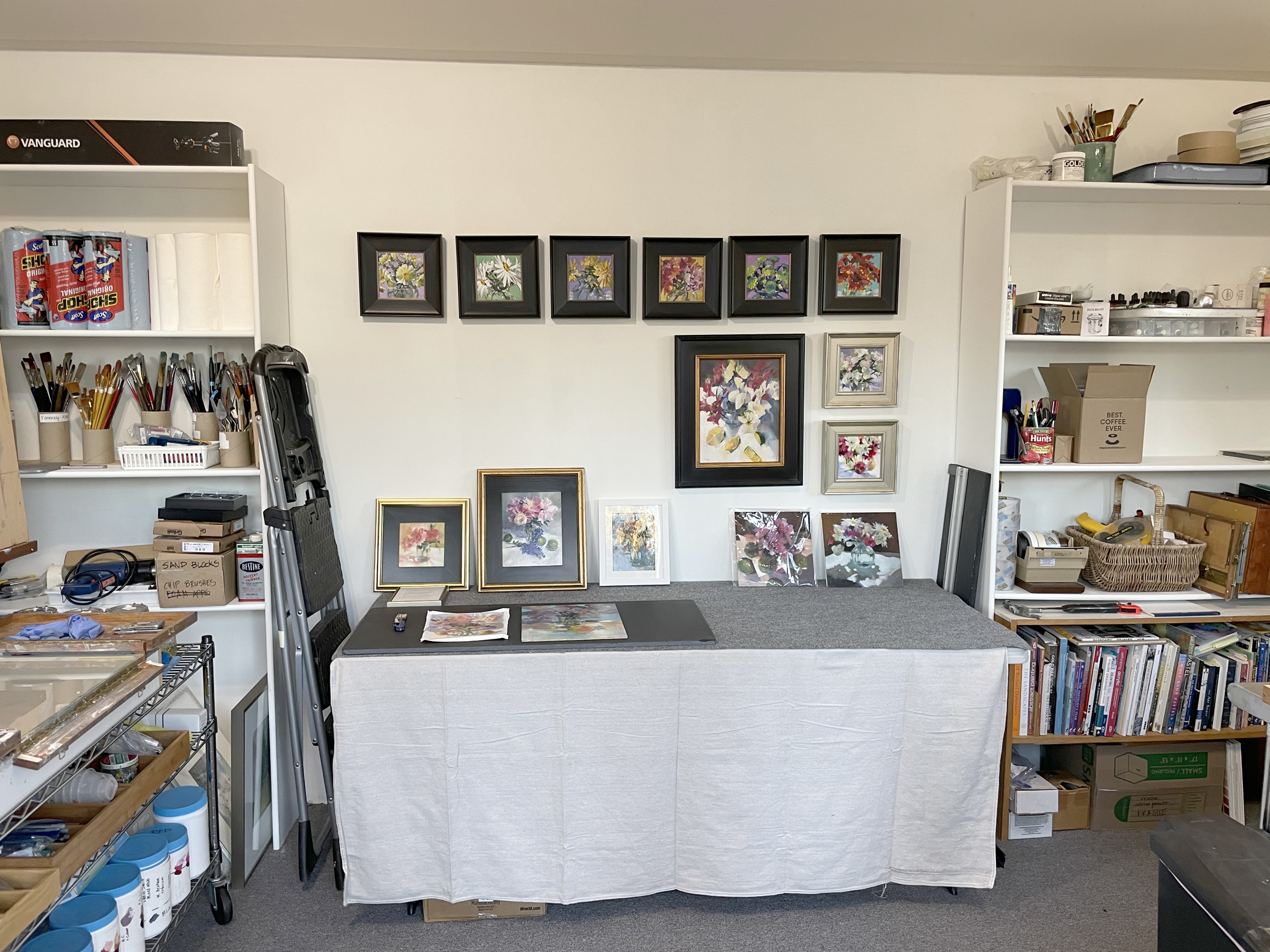
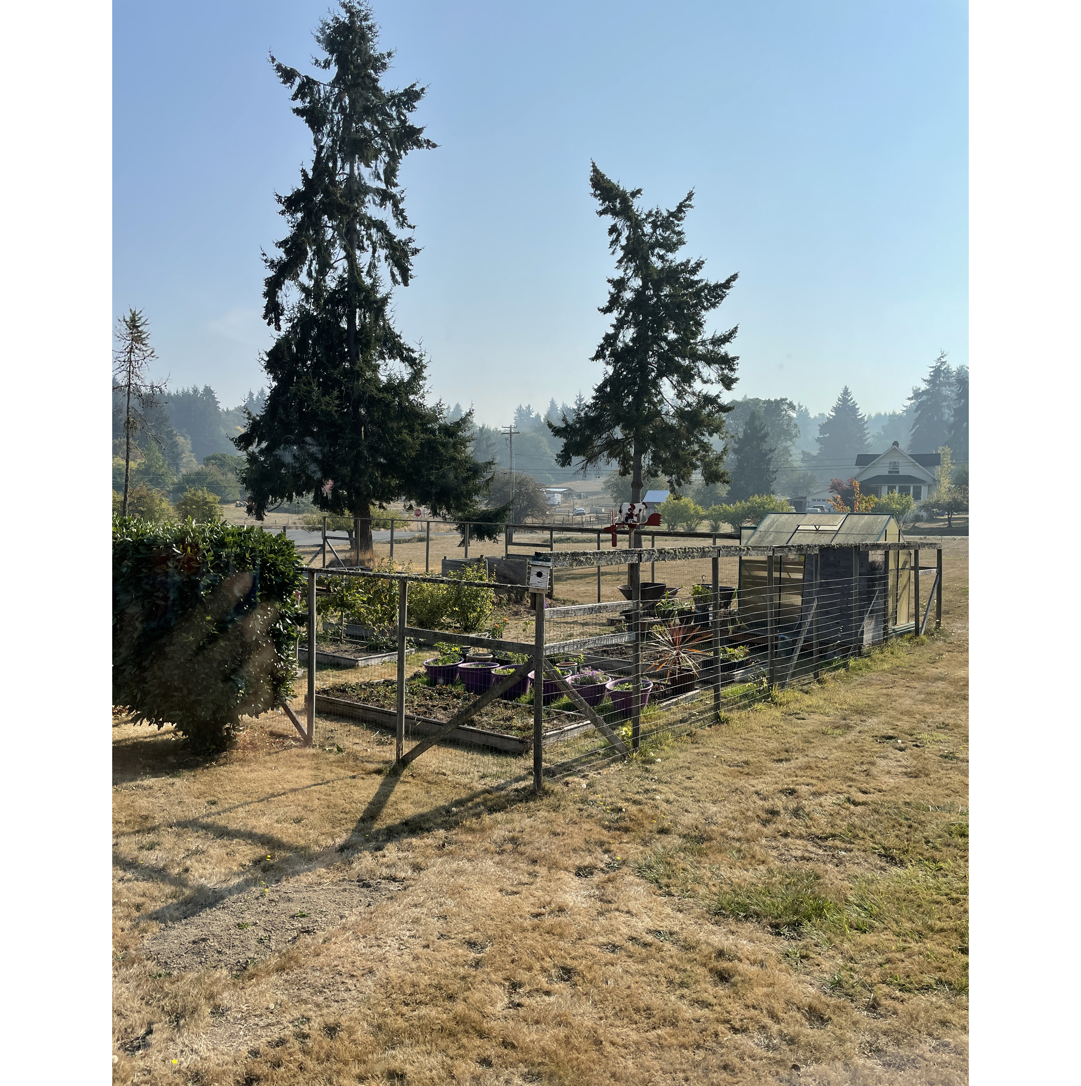
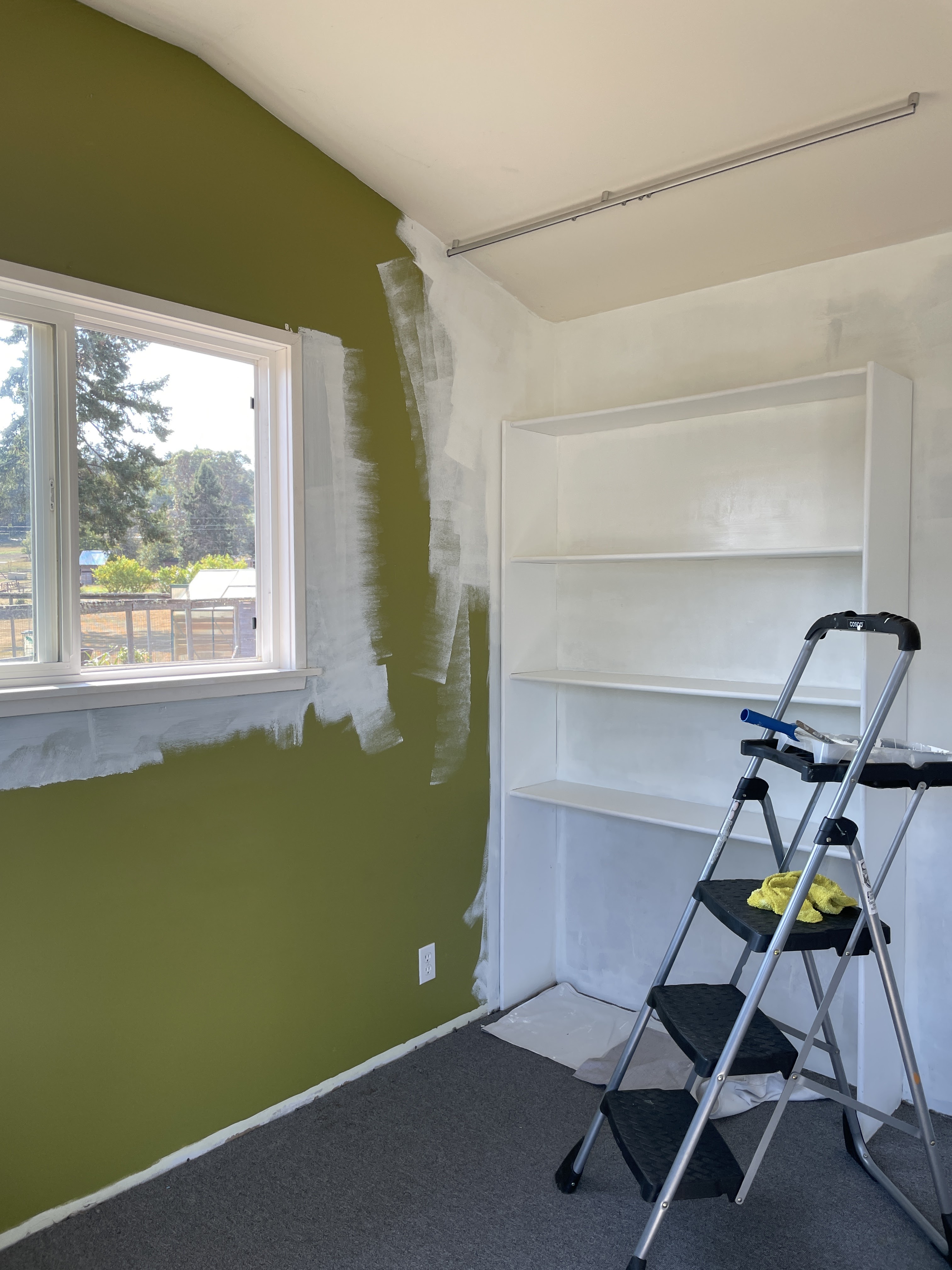
Tuesday, June 11, 2013

Can you spell Albuquerque?


I'm not a fan of traveling...a day spent at home in my studio is the norm for me but it is my favorite place to be. When I received notice last year that I had earned acceptance into the Master Circle of International Association of Pastel Socities (IAPS) I was honored, but my second thought was uh-oh because I knew the IAPS-MC medals were presented at the Convention that takes place every other year in Albuquerque, NM. So, like it or not, it looked like I'd be traveling.

I'm back now and this truly impressive medal is with me in the Studio. I'm so glad I went and of course, I'm so glad to be back. The Convention is a big party with all the rock-stars of the pastel world there. I had the opportunity to meet artists I'd previously known only via the internet and also to reconnect with old friends. It was extra special to have served as one of the three Jurors of Selection for the 22nd Juried Exhibition. The art in that show, as well as the work in the Second Master Circle Exhibition, was outstanding.
Old Town is charming, colorful, and funky. We took a walking tour that was fun and educational and we enjoyed the morning warmth but avoided the afternoon heat. Lunch at La Crepe Michel (twice!) was a highlight as was the twisted lemon ice cream cone from a nearby shop. I'm looking for a window or door to paint Virgin Mary Blue, preferably West-facing to ward off evil. And, if not for this honor, I might have gone my whole life without knowing how to spell Albuquerque!

IAPS is made up of pastel societies from around the world. Find a pastel society near you.

Monday, May 27, 2013

the same but different

In the summer of 2010, as an experiment, I painted the same scene twice. The first painting, "Summer Sojourn," went to a gallery and on to a new home. It is also published on page 211 of my Art Answers: Pastel book.

Today, I brought the second version out of storage. "Summer Sojourn II" was an experiment in process vs product and has some exciting foundation work showing through the pastel. Click on the title above, then click on the image and see the upper right corner.

I started to unframe this painting to post it on my Studio Sale blog for the month of June but halfway through I thought, why not just sell it framed? Image size 9x8, frame size 15x13, Nielsen German Silver metal frame with white archival mat and glass. For purchase information, click on the Studio Sales link in the sidebar.

Friday, May 24, 2013

backstory on my book

Yesterday, I received the first copies of my book! It was a unique project with my part completed in record time.

One morning in mid August of last year, I made a new folder for my computer desktop labeled "My Book." I had been thinking for some time about self-publishing a book of my work with a few step-by-step demonstrations. In the folder, I filed links, ideas, and images of my work. Within 30 minutes, I received an email from Quantum Publishers in the UK asking if I would be interested in authoring a pastel book for them! I just sat in awe, looking at that email. I wasn't familiar with Quantum and I still don't know why they contacted ME. But, I was happy that they did.

It sounded like an interesting project: Quantum has published pastel books in the past and they wanted someone to compile text and images from existing books into a new book for their series called Art Answers. I needed to come up with 200 questions about pastel in 30 days. I could do that!

Very quickly, I learned that not only did I have to submit the questions BUT ALSO THE ANSWERS in that short time period. Quantum air-mailed the existing books to me and I began to work on this huge puzzle: first, start with one of my questions, then read through four existing books and answer the question by combining existing text and images for artists in both the UK and the US. I also wrote new text illustrated with my images for many of the questions.

I love this little book! From the four existing books, I had the opportunity to include previously published images of artists whom I admire - Sally Strand, Kitty Wallis, Doug Dawson, Jackie Simmonds, Carole Katchen and others.

I was also able to give a shout-out to Artist's Air and Paula Ann Ford on page 45 for the question, "Are there health concerns when using pastel?" and to introduce Terry Ludwig Pastels to UK artists.

While typing this post, I have gone through the book page by page. I must point out that this is a book of information, not a book of beautifully reproduced images. The color of my paintings in this book motivates me to return to the "My Book" folder to self-publish a book!

Many thanks to the folks at Quantum and Barrons for this opportunity. Purchase Information.


Wednesday, May 22, 2013

young at heart completed

May 10th, I posted "Young at Heart" in progress and after 12 days of painting and pondering, I'm calling it done. 24 x 24 inches, oil on wood panel.

Wednesday, May 15, 2013

packing puzzle

I LOVE my good old Airfloat shipping boxes and this morning I am using them once again to ship a couple paintings to the IAPS show. Over the years, the various sizes of art I've shipped has resulted in foam pieces of all shapes and sizes.  I have often thought about the person who has to redo this packaging puzzle to send my work back to me at the end of the show. To make their job easier, I take a photo of how I put the foam and art puzzle together and tape the photo to the inside of the box for their reference.

Saturday, May 11, 2013

dawning

Dawning
oil
6x8 inches

Friday, May 10, 2013

don't rush to detail

When I teach, I encourage my students to make thumbnails but I usually forget to make them for myself. My workshop with Lorenzo Chavez last week was a thumbnail reminder to block in composition shapes with several values. Before going back to my 24 x 24 inch oil in progress, I revisited the composition and values as shown above in my sketchbook.

Back at the easel, I mixed a thin oil wash of Alizarin Crimson and Ultramarine Blue and brushed it over all but the lightest areas in my painting. Note the mixture is warmer (more red than blue) in the right front and cooler (more blue than red) as the scene moves into the background.

I have a tendency to rush toward the detail in a painting before I should. This painting is better already. Thank you, Lorenzo, for making me paint right over my precious details while at the workshop.

Thursday, May 9, 2013

thank you!

Yesterday I received a very special honor: Life Membership in Women Painters of WashingtonThank you WPW!

This distinction is given in recognition of outstanding service to the organization. My 15 years working with the members of WPW has been rewarding to me in so many ways; I encourage women painters in the state of Washington to apply for membership.


Tuesday, May 7, 2013

update

I had hoped to post the finished oil version of "Young at Heart" by now but the past week has flown by.

I rarely take workshops but I spent three days last week in one instructed by Lorenzo Chavez and I'm glad I did. He is a kind and thoughtful instructor. His enthusiasm for thumbnails has reminded me how important they are. He clearly communicated how to simplify our compositions and how to block in different planes (sky, uprights, ground) with the correct value (especially useful when working plein air).

Saturday, while I was judging the Miniature Category for the Edmonds Arts Festival, my painting, "Arboretum Winter Color" was receiving a Juror's Award from Mr. Chavez at the Northwest Pastel Society's 27th International Open Show at American Art Company, Tacoma, WA.

We've had unseasonably warm weather here in Washington state. Spring is bustin' out all over so weed-eating is back on my agenda.

And, last but not least, my 5x7 inch pastel color study "Young at Heart" is in its last days of auction at Daily Paintworks.


Friday, May 3, 2013

coming along

"Young at Heart," 24 x 24 inch oil is coming along. I'll pause again for a few days to reflect on this.

Thursday, May 2, 2013

lavender comes next

Ahhh...that helped move me forward. I enclosed the pastel color study in a poly sleeve (whichever poly this is, it doesn't create static) and kept it beside me as I added lavender oil paint.

Tuesday, April 30, 2013

pause for a color study

Young at Heart
5x7 inches
pastel

In my post of April 26th, I showed you the foundation for a 24 x 24 inch oil - "Young at Heart." After being stuck there for a couple days, looking at it and trying to get a clear vision for the finished painting, I resorted to my usual method of working and made a small color study of the scene.

This one is in pastel, 5x7 inches and will be available on Daily Paintworks beginning May 3rd. I delayed the start of the auction for a few days so I could paint the oil with the pastel color study beside me for reference of color, value, and most of all, a reminder to keep my paint strokes fresh and loose.

Saturday, April 27, 2013

it's studio sale time

Suddenly it is the end of the month and time for another painting from my studio for the Studio Sale link.

About 10 years ago, I co-authored a book on watercolor pencil for Walter Foster Artist's Library Series. These are great little books to introduce the novice to a new medium.


This month's Studio Sale offering is "Full Bloom #2," watercolor pencil, 11.25x9 inches. For purchase information go to the Studio Sales link in the sidebar.

Friday, April 26, 2013

line drawing and first strokes

 Tentatively titled "Young at Heart," this is the first oil (24x24 inches) from the Pt. Defiance Park reference photos. Above: the charcoal line drawing on white gessoed wood panel. Below: the first strokes for value and mass.

Wednesday, April 24, 2013

spring photo shoot

I went on a spring photo shoot yesterday at Point Defiance Park, Tacoma, WA. Lots of fresh yellow greens, end-of-winter hazy lavenders and lush green-gold moss! Above is one of the horizontal frame reference photos. I want to paint this scene in a square format so I distorted, then cropped, the photo in my computer to make it square. Next, I changed the mode to gray scale to better see the values for my foundation painting.  Yeah spring!


Wednesday, April 17, 2013

spring!

 
Spring!
pastel
7x5 inches


new transfer method

In an effort to cut down on the amount of paper in my life, today I'm using this method for transferring a reference photo image to my painting surface.

I drew an X on a clear poly envelope and slipped my iPad inside. Using a charcoal stick, I transferred the scene to a gessoed painting surface. Yay! One piece of paper and printer ink saved because I didn't print the reference photo.

Tuesday, April 16, 2013

done with winter


I am done with winter. It is time to move away from the wintery Nisqually Wildlife Refuge reference photos and on to spring.

For this last oil painting of the Nisqually series, I applied a tonal foundation, then I referred to my color notes on my pastel painting, "Spring Light, Winter Shade." To see the foundation and first step of color of this painting, click here.
"From Now Until Then," 24x24 inches, oil on wood panel.

Saturday, April 13, 2013

changes to reverie

A lot has happened to the painting in my March 25th post. I answered some of the questions posted there and then asked and answered more. I also changed the name from the working title, Reverie, to "Until We Meet Again." 24x24 inches, oil on panel.

Sunday, April 7, 2013

a new book about pastels

Finally! Here is the news I've alluded to a couple times on my blog since last August.

Art Answers: Pastels Drawing will be published in the UK and in the US in June. This is a book I compiled of 200 questions and answers. It features images of my pastel paintings, step by step demos and text. I have also included other pastel artists' work and words. What started out as a minor project turned into a major undertaking that I am proud of. I've seen the proof but look forward to holding the finished book in my hands.

Also, my July 2013 pastel workshop, Landscape Impressions, is full with a waiting list. Thanks to all who responded. I hope to have this new book available at the workshop as well as online. I'll keep you posted!

Wednesday, April 3, 2013

march moment

This is a demo from a private class today, another scene from my Nisqually Wildlife Refuge reference photos. Working with 3 values and keeping it simple with a black acrylic underpainting.
"March Moment," 8x6 inches, pastel on Wallis paper mounted on 4 ply archival matboard. You can look at it with the magnifier tool here http://www.dailypaintworks.com/Artists/barbara-benedetti-newton-2335 


Friday, March 29, 2013

trilogy posted to studio sales

It's the first of a new month (almost) and time for another Studio Sale posting.

This month, watercolor painting, Trilogy is looking for a loving home. Select the Studio Sales link in the sidebar to the right or, click on the title of the drawing.

Wednesday, March 27, 2013

spring forward steps

A bright spot on our dog-walk is a Forsythia bush now in full bloom. I wanted to paint it as one of the first colorful signs of spring.

Step 1: I have several 7x5 inch Ampersand Pastelbord panels with abstract oil-wash foundations. Using my reference photo in grayscale as well as in color, I laid in a black acrylic map of the darkest area for a little pastel painting called "Spring Forward." 

Step 2: The image on the left has the addition of blue pastel in the sky and water.

Step3: All colors except the yellow of the Forsythia have been added to the image on right.

"Spring Forward"
7x5 pastel

Monday, March 25, 2013

reverie progress report

Progress Report or, Questions I am asking myself:

1.  Do I want to lighten the water to better match the 6x6 value study? YES, but not that bright, this is a different mood or time of day.

2.  Do I want to become more literal in the grasses under the water in the foreground and, if I do that, will it be too much contrast in technique to the way the background was handled.

3. Do I want to add more details (those tempting peekholes) to the tree mass in the background?

4. Do I need to resolve the background shoreline vs the landmass in upper right? YES, done.

5. Do I want to add more clumps of grasses in lower right that would lighten the values in that corner?

6. Do I want to make the grasses curve around on the right upper? YES, done.

7. Do I know when to walk away? And, while I am away, I will use PhotoShop to make all the adjustments I have questions about to see if they work.

Notice that none of these questions is about color. I'm good with that because this painting is about creating mood with a very limited palette.

Sunday, March 24, 2013

reverie foundation

I love to paint the foundations of oil paintings. This 24x24 oil is called Reverie and I'm working from the 6x6 oil study of the same name. I'm thinking of leaving both of these in the foundation stage rather than taking them into full color.


Friday, March 22, 2013

the path of least resistance

Yesterday was the first day of spring, today we had snow in Washington. At the change of seasons, I find myself in a reflective mood. Winter is over - what were the events of my winter that are memorable? What do I want to make of Spring 2013? One thing, paint bigger. This is a 24x24 inch oil from the Nisqually Refuge series. Water filling nooks and crannies as grasses define its path of least resistance.

What is my painting-path of least resistance?

1. Establishing the composition using values only. I covered most of the painting surface with a medium value sepia tone then brushed or wiped away paint for the lightest areas and added full color paint for the darkest areas.

2. Using a color palette already familiar to me, I am using the notes from a previous painting to begin adding color.

Thursday, March 21, 2013

a bright tomorrow framed

A Bright Tomorrow
oil
5x7 inches

sun slide, over and over

Smaller does not mean faster! I spent most of yesterday on this 5x7 pastel called "Sun Slide ." It could have been called brain slide. Or, maybe I was thinking too much.

I was very happy with the black acrylic foundation work on an Ampersand Pastelbord panel shown above but it was downhill (no pun intended) after that. Put pastel on, wipe it off, repeat, repeat. I finally ended up with a different painting than I had in mind so I left it, ate a big plate of my comfort food (spaghetti) and went to bed. By this morning I was over what I expected it to look like and now appreciate it for it's delicate color (click to enlarge).

Tuesday, March 19, 2013

big surprise workshop

I'm going to teach a very small pastel workshop, Landscape Impressions, at my Studio in Renton, WA July 22-23, 2013.

No one is more surprised at this turn of events than me! I was a long-time instructor at Frye Art Museum in Seattle and at Sitka Center for Art and Ecology in OR. I finally quit teaching to concentrate on my own work. Now, I find myself wanting to share my thoughts and painting process again, in-person with other artists.

I need one more student. If you are interested in painting plein air with me and the above dates and location work for you, send me an email  barbaranewton (at) comcast (dot) net and I'll send you additional information. Note: sometimes it rains on July 22-23 in Washington state. If that happens, we'll paint in my studio from your reference photos and mine. That is the reason I have to keep the class size very small.


Monday, March 18, 2013

spring light color study - framed

Spring Light Color Study
pastel, 5 x 7 inches

Sunday, March 17, 2013

four demos

I came across these four demos in my flat file and will post them for purchase on Etsy. Clockwise from upper left:  Pear Demo for pastel workshop at Frye Art Museum, Two Cherries, watercolor with colored pencil, Lilies and Lace - this appeared in a national magazine as a step x step colored pencil demo, Glass Reflections in colored pencil on gray paper. My shop at Etsy is called BBNewton Art.

Friday, March 15, 2013

spring stream - framed


Spring Stream
oil,  6 x 8 inches


Thursday, March 14, 2013

true love in two mediums

Yesterday I finished the 18x18 inch oil painting based on my 5x7 inch pastel color study. Similar scene, different format - square instead of rectangular, different mood - changed the direction of the light source, different medium. And of course, a different painting experience with each medium.


Monday, March 11, 2013

using the color study

This is 'Spring Light, Winter Shade,' pastel, 14.5 x 20 inches.

I used the 5x7 color study as my guide to apply the oil wash foundation to Wallis paper last night. This morning, with the color study beside me, I began adding pastel, went for a dog-walk, ran some errands and finished the painting in the afternoon. Another painting, my first full-size pastel, under my new studio lights.

Sunday, March 10, 2013

it's about the light

For this little color study, the first from the reference photos taken at the Nisqually Refuge, it's about the light. When we started our mile walk, it was winter but the sun came out for the last 15 minutes.

'It was one of those March days when the sun shines hot and the wind blows cold: when it is summer in the light, and winter in the shade'   Charles Dickens

It's also about the new lights in my studio. I seem to be seeing/thinking/painting lighter and perhaps with more punch (range of value, contrast).

true love framed

Color Study for True Love
5x7 pastel

Saturday, March 9, 2013

119 reference photos

The BEST photo shoot yesterday! 119 photos of the Nisqually National Wildlife Refuge. You know how much I love marshy scenes. This estuary was wonderful!